
Before & After: A Repaint Adds Contrast to This Sunset Park Condo
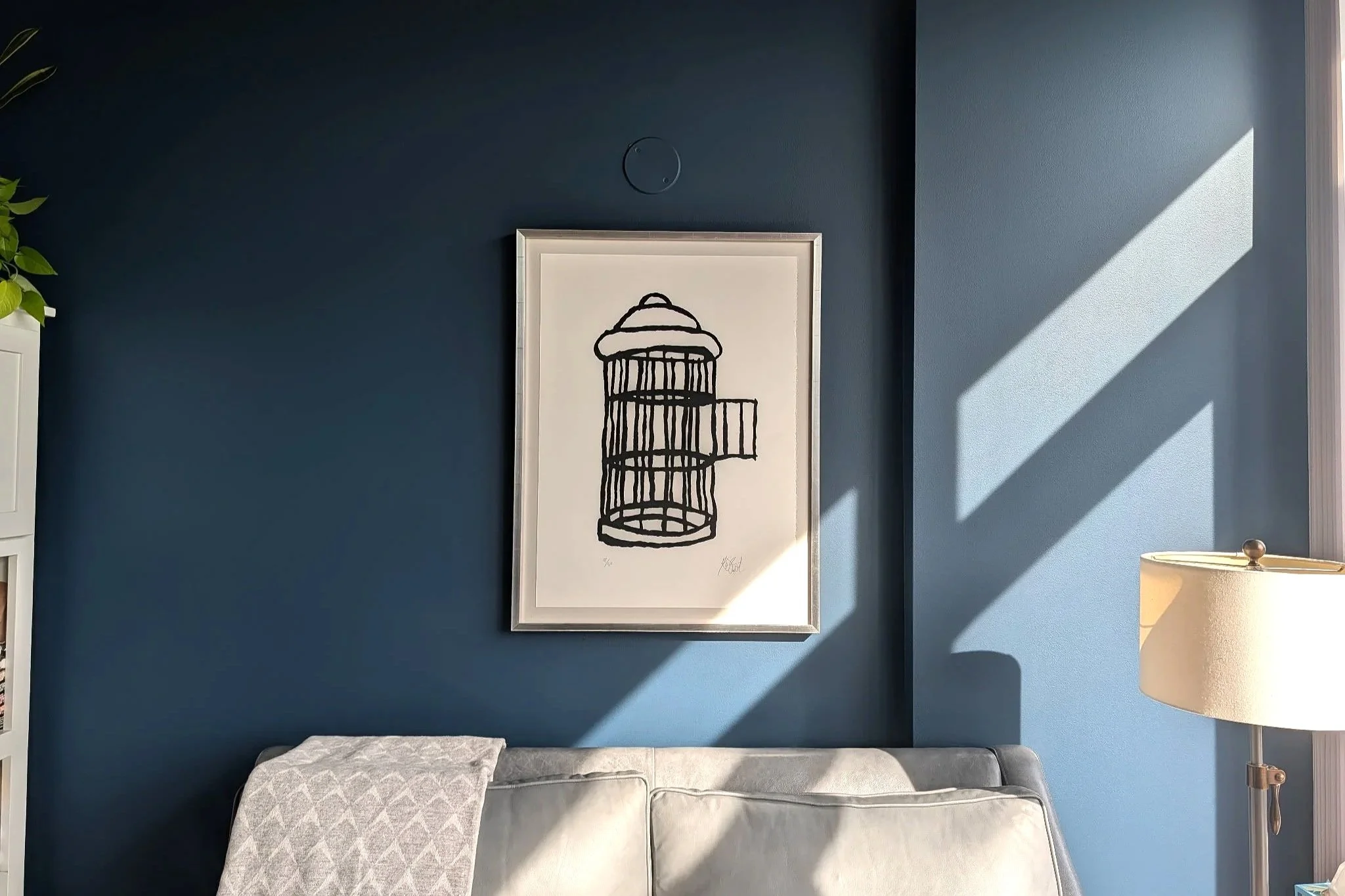
After nearly a decade of everyday wear, this Sunset Park duplex condo was ready for a refresh. The homeowners weren’t looking to reinvent a home they already loved.
Instead, the goal was to make the existing design feel brighter, more cohesive, and more intentional—while integrating newly installed custom cabinetry and closets into the overall color palette.We repainted key spaces throughout the duplex, using precise color matching and a few strategically placed darker colors to give the home a more polished, design-forward finish.
Project Snapshot:
Neighborhood: Sunset Park, Brooklyn
Property Type: Duplex condo
Rooms & Areas Included: Entire first floor, including living and dining areas, hallways, partial kitchen, three-story stairwell, entry door, primary bedroom, and select touch-ups in the second-floor den.
Services Performed: Full interior repaint and color matching, including walls, select doors, trim and the metal stair structure and railings.
Client Goal: Refresh the home after years of wear and tear while maintaining its existing color direction. Newly installed cabinetry and custom closets also needed to feel integrated with the surrounding rooms rather than added on after the fact.
The biggest opportunity was the three-story staircase. Rather than simply refreshing the existing builder-grade light gray, we used a deep charcoal to turn the architectural stair structure into a defining feature of the duplex.
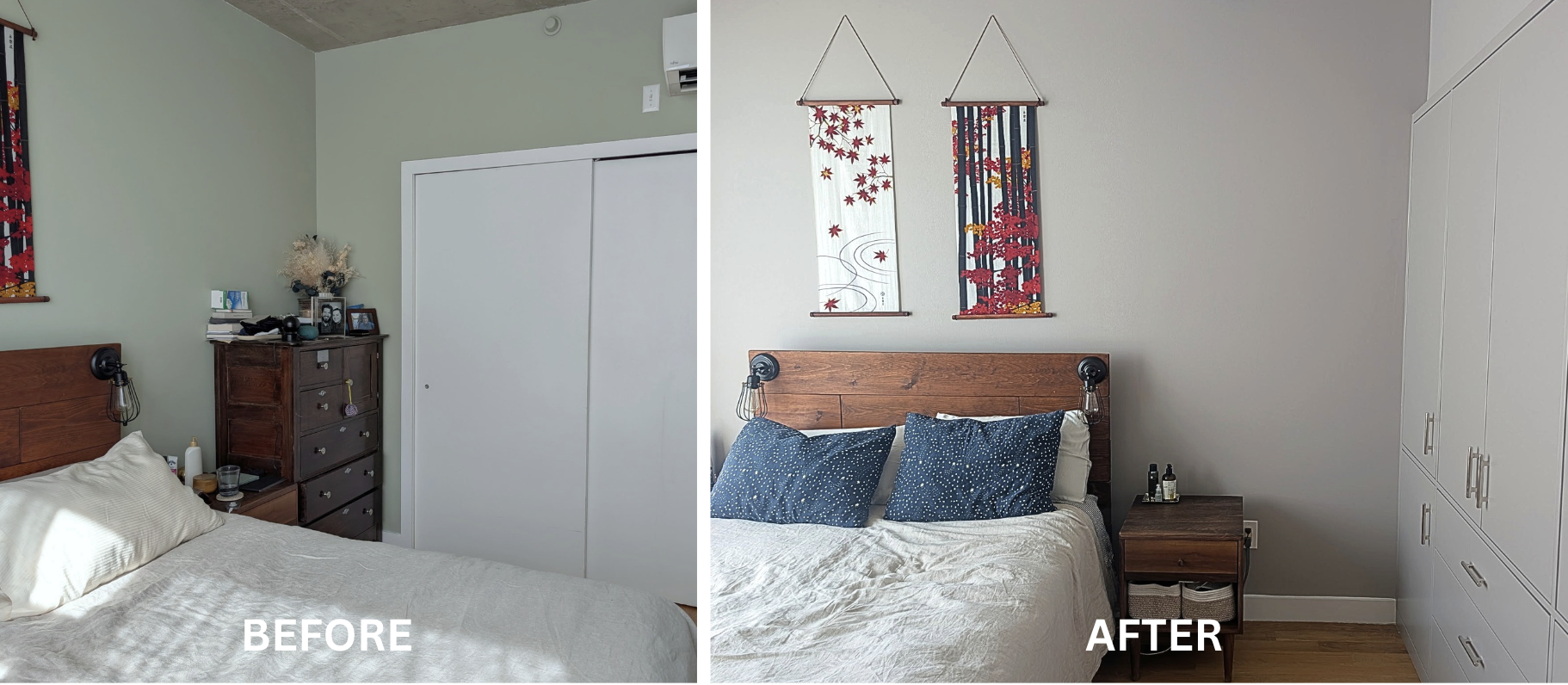
Image: Undertone Interiors
The Challenge
The home already had strong architectural elements: high ceilings, exposed concrete, warm wood flooring and stair treads, custom built-ins, and an open multi-level layout. The challenge wasn't to introduce an entirely new design concept. It was to make those existing elements work better together.
After nearly a decade, the original paint was showing normal wear and the palette no longer felt as crisp as it once had. At the same time, newly installed cabinetry and closets introduced new finishes that needed to coordinate with the surrounding walls.
Our approach focused on color continuity, contrast and architectural definition. The lighter neutrals would keep the apartment bright, while carefully chosen darker colors would give key areas more depth and visual interest.
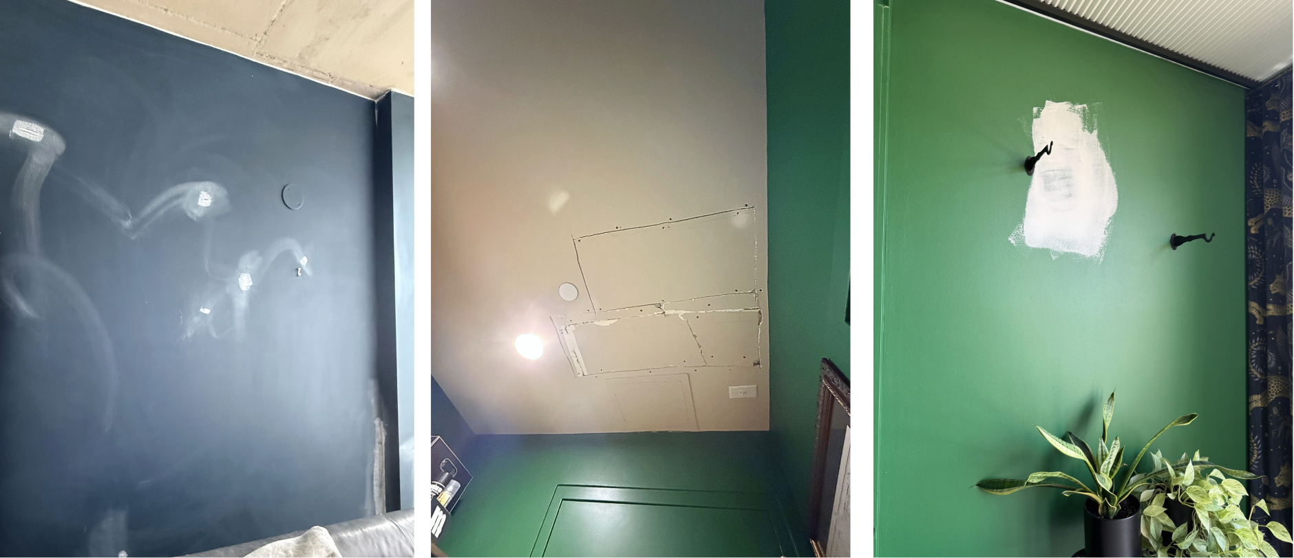
Image: Undertone Interiors
When Less is More
One of the most important aspects of this project was knowing where not to make a dramatic change. The homeowners already had a palette that worked for the space, so the project wasn't about introducing color for its own sake.
Instead, we used subtle color matching to connect new and existing elements and concentrated stronger color in places where it would have the most impact.
The combination included:
Benjamin Moore Stonington Gray — living and dining areas and hallways
Benjamin Moore Chantilly Lace — contrasting white trim
Benjamin Moore Gentleman’s Gray — deep blue living room accent wall
Farrow & Ball Dove Tale — primary bedroom, coordinated with custom closets
Farrow & Ball Railings — staircase, railings and select doors
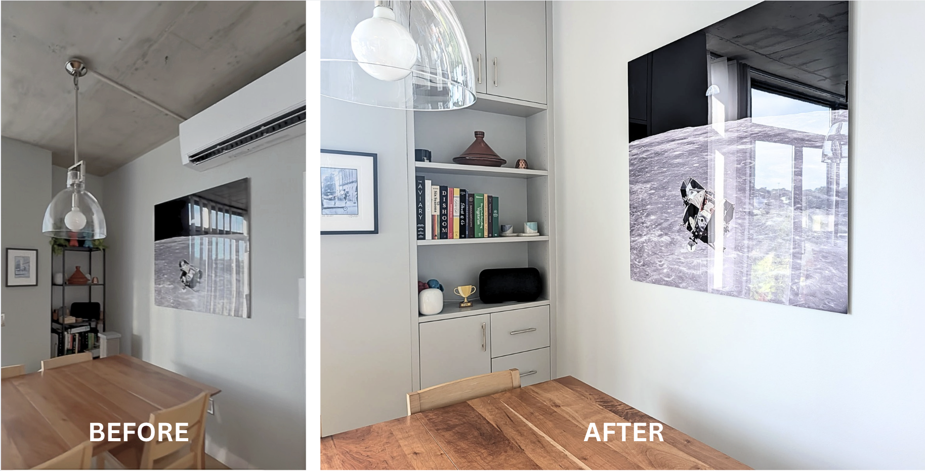
Image: Undertone Interiors
Our Approach
Throughout the main living, dining and hallway spaces, we used Benjamin Moore Stonington Gray, color matched to coordinate with the home's new cabinetry. The soft gray creates a clean backdrop without competing with the wood floors, furnishings or exposed concrete ceilings.
Existing contrasting trim was refreshed in Benjamin Moore Chantilly Lace, giving doors, baseboards and architectural edges a crisp finish against the gray walls.
In the primary bedroom, we matched the walls to the newly installed custom closets using Farrow & Ball Dove Tale. Extending the color beyond the cabinetry creates a more seamless effect, allowing the built-ins to feel integrated into the architecture of the room.
The living room received a more dramatic update with an accent wall in Benjamin Moore Gentleman’s Gray. Despite its name, the color reads as a sophisticated deep blue with teal undertones. Against the lighter surrounding walls and white trim, it adds depth without overwhelming the room.
But the biggest transformation came from the staircase.
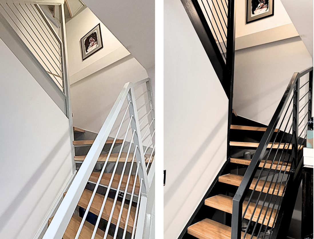
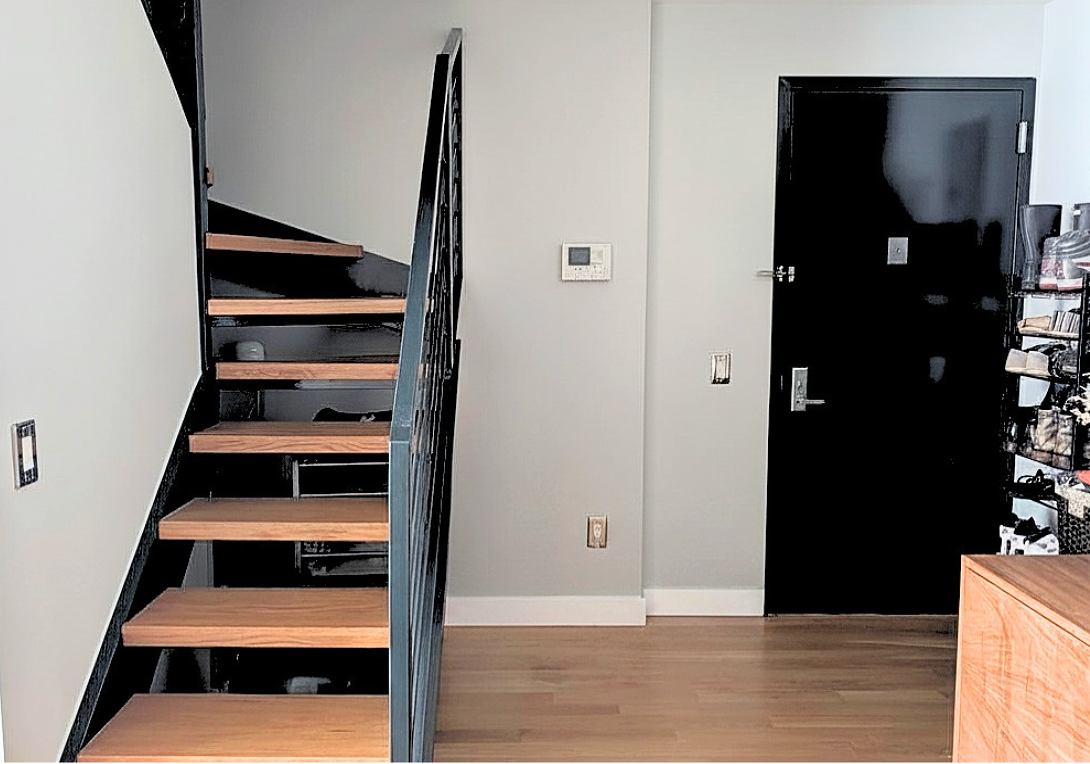
Image: Undertone Interiors
The Transformation
The three-story metal staircase is visible from multiple areas of the duplex, making it a major architectural element whether it was treated that way or not.
Previously finished in a standard light gray, the staircase blended into the surrounding walls. We repainted the metal structure, railings and related architectural elements in Farrow & Ball Railings, a near-black charcoal with subtle blue undertones.
The darker finish completely changes how the staircase reads within the apartment.
Instead of disappearing into the background, the stair structure now provides a graphic contrast against the lighter walls while emphasizing the warmth of the natural wood treads. The result feels more deliberate and better suited to the home's industrial-modern architecture.
We carried the dark gray onto the main entry door and the door leading to the upstairs roof deck, creating visual continuity across multiple levels of the home.
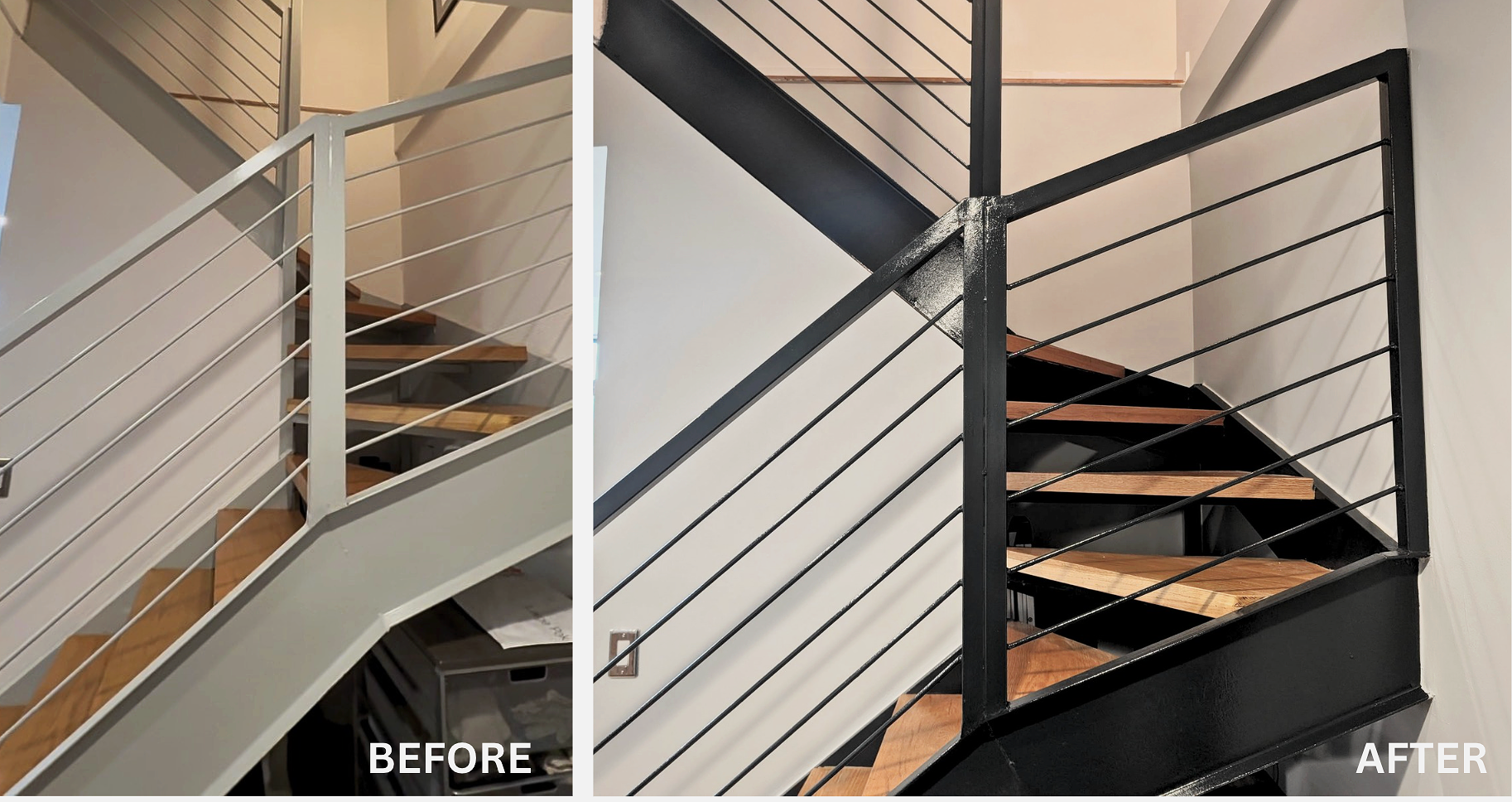
Image: Undertone Interiors
The Results!
Together, the colors create a layered neutral palette rather than a conventional all-white or all-gray interior. The finished duplex feels noticeably fresher without losing the character or design choices the homeowners already liked.
The lighter gray living spaces provide a clean, cohesive foundation. The bedroom cabinetry now feels integrated into the room rather than visually separate from it. Gentleman’s Gray introduces a rich focal point in the living room, while the crisp white trim keeps the deeper colors feeling sharp.
Most importantly, the newly darkened staircase gives the center of the duplex considerably more architectural presence. Against the natural wood treads, pale walls and exposed concrete, the charcoal finish helps connect the home's industrial elements with its warmer residential finishes.
It's a good example of how an interior repaint doesn't always require a completely new color palette to significantly change a home. Sometimes the stronger design decision is refining what already works—and adding contrast exactly where the architecture calls for it.
Got your own design project in mind? Contact us to schedule an estimate and get a quote.