
How Does Lighting Affect Paint Color?
What to Know Before Choosing a Shade
Choosing a paint color isn’t just about the swatch - it’s also about the environment that color lives in (or as we like to say, Color Beyond the Surface). Light has a direct and often dramatic impact on how paint reads once it’s on your walls. The same color can feel airy and refined in one room, and heavy or dull in another, simply based on lighting conditions. If you’re painting in New York City, take into account that apartment layouts, window exposure, and lighting vary widely, and can greatly impact how colors look and feel in your home.
Here’s how to think about paint color through the lens of light.
High Natural Light:
Bright, Soft, and Sometimes Washed Out
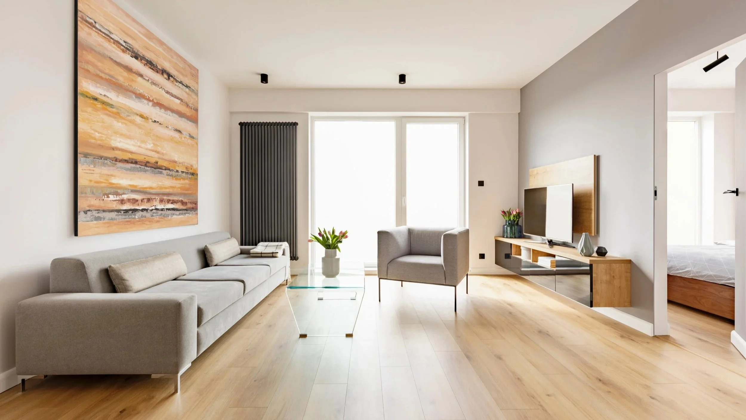
Anyone who rents or lives in New York City knows how in-demand southern-facing apartments and large windows are. Even the smallest of dwellings can be completely transformed by lots of natural sunlight and connection to the outside. And it also makes choosing a paint color much easier in terms of suitable options.
Rooms with abundant natural light will amplify brightness and soften how colors appear. Paint tends to look lighter, less saturated, and slightly cooler under direct sunlight.
This can work in your favor if you’re aiming for a clean, elevated aesthetic. However, it can also dilute more complex or bold tones. A rich grayish-brown, for example, might lose depth and read closer to an off-white during peak daylight hours.
Painting Tip: If a space gets strong natural light, you can often go slightly deeper or warmer than your initial instinct without overwhelming the room. One thing to keep in mind however - the more a surface reflects light, the more prone it is to showing imperfections (bumps, cracks, dents - think plaster).
Avoid using high-gloss finishes and instead opt for a more subtle sheen like eggshell, flat, or even matte. Eggshell’s washability is best for higher traffic areas that aren’t suited to glossy finishes (like bright family rooms or kids’ bedrooms).
High Artificial Light:
Warmer, More Saturated Tones
Artificial lighting such as warm LEDs or incandescent bulbs often adds a yellow or amber cast to your space. This tends to make colors feel warmer and more saturated than they do in daylight.
Neutrals can shift quickly here. A balanced white might read creamy, while a beige could lean more golden than expected. In spaces heavily reliant on artificial light (common in interior NYC rooms), this shift becomes the dominant experience of the color.
Painting Tip: The type and temperature of your lighting can significantly effect how paint looks in a room. The types of lighting range from task or accent (small, focused spaces like desk lamps or alcove) to overhead lighting (recessed ceiling lights, chandeliers, track lighting, pendant lamps), and floor lighting (think arched or upright lamps, sconces).
Choose the bulb temperature (measured in Kelvin or “K”) based on the mood and colors in your space: warm light (2700K–3000K) softens colors and adds warmth, while cooler light (4000K–5000K) makes colors appear brighter, crisper, and more true to tone. Avoid going above 6000 unless your goal is hospital or office-chic. Then consider brightness (lumens) — higher brightness will make colors feel more vibrant and defined, while lower light creates a softer, more muted look.
Low Natural Light:
Deeper, Moodier, and More Muted
Rooms with limited natural light—north-facing spaces, interior rooms, or apartments facing brick walls—tend to pull colors darker and more subdued. Undertones become more pronounced, particularly cooler or gray bases.
This is where homeowners often get tripped up. A color that looked balanced in a showroom or online can feel unexpectedly heavy or flat once applied.
Painting Tip: In low natural light, avoid overly muddy or gray-heavy tones unless you’re intentionally going for a moody, saturated look. Otherwise, opt for colors with a bit more warmth or clarity to keep the space from feeling flat.
Darker colors or color drenching (painting the walls, ceiling, and trim all the same shade) can make an already dim room look smaller. At the same time, it can make a larger room feel more cozy and add more drama. Your choice.
Low Artificial Light:
Flat, Shadowed, and Underwhelming
When a room lacks both natural and sufficient artificial light, color loses dimension. Even well-chosen shades can appear flat, dull, or shadowed. Depth disappears, and the walls can feel visually compressed.
This is less about the paint color and more about the lighting strategy itself.
Painting Tip: Before over-correcting with paint, fix the lighting. Layered lighting (overhead, sconces, lamps) will do more to elevate the space than chasing the perfect color.
While you may not be able to control the amount of natural sunlight, choosing the right lighting temperature and type (i.e. functional / task lights, floor lighting, overhead lighting) can drastically change the look, feel, and comfort of a space.
Check out LuxDeco’s Ultimate Guide to Luxury Interior Lighting.
In Summary
Paint doesn’t exist in isolation—it’s constantly interacting with light throughout the day. That’s why sampling directly on your walls, and observing color at different times (morning, afternoon, evening), is non-negotiable if you want a high-end result.
If you approach color selection without accounting for lighting, you’re guessing. If you account for it, you’re designing.
Ready to Paint?
Picking the right paint colors can be overwhelming, with the huge selection of brands and shades out there. Let us help you choose the best colors and finishes for your space. Contact usto set up a free virtual or in-home estimate.