
What is Color Drenching (& How to Do it Right)
A Design-Forward Approach to Transforming Small Homes & NYC Apartments
There’s a reason color drenching has become one of the most talked-about interior paint trends in recent years — when done well, it can completely transform the way a space feels. In New York apartments especially, where square footage is limited and architectural details are often inconsistent, color drenching can make a room feel larger, calmer, more intentional, and significantly more elevated.
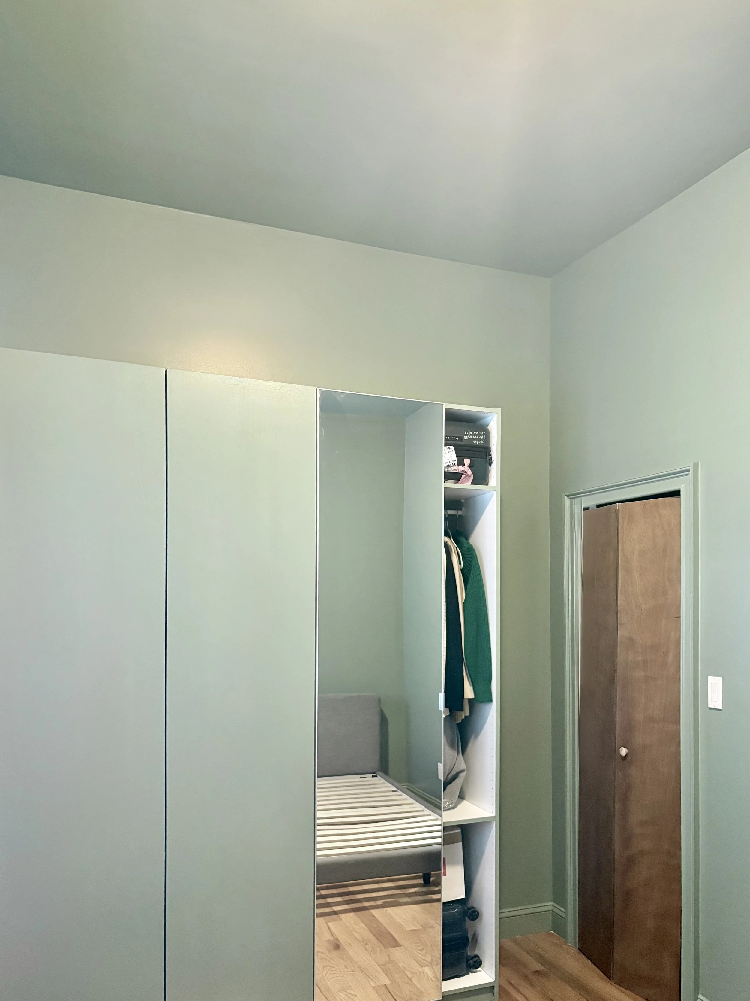
At its core, color drenching means painting multiple surfaces in the same color — typically the walls, trim, doors, ceilings, and sometimes even built-ins or radiators. Rather than creating contrast between surfaces, the goal is to blur boundaries and create a more immersive, cohesive environment.
The effect can be dramatic or subtle depending on the color, finish, light, and scale of the room.
Why Color Drenching Works Well in Small Spaces
Most NYC apartments are visually fragmented. White ceilings. White trim. Different wall colors from room to room. Shadows from awkward layouts. Minimal natural light. All of those visual interruptions make a space feel busier and smaller.
Color drenching simplifies the visual experience.
When your eye is no longer stopping at contrasting trim lines, ceiling breaks, or bright white doors, the room begins to feel more continuous. That continuity creates a surprising sense of spaciousness — even in smaller rooms.
But the impact depends entirely on the colors and finishes you choose.
Light vs. Dark Colors: Different Results
Light Color Drenching: Airy, Soft, Expansive
Soft whites, warm creams, muted taupes, pale sages, dusty blues, and light greiges can make a small apartment feel larger and brighter when used across all surfaces.
Because there are fewer visual interruptions, light reflects more evenly throughout the room. Corners soften. Ceiling heights feel less abrupt. Spaces often feel calmer and more architectural.
This approach works especially well in:
Smaller bedrooms
Railroad apartments
Studios
Hallways with limited natural light
Apartments with lower ceilings
A soft warm white drenched across walls, trim, and ceiling often feels significantly more refined than a traditional “white walls + bright white trim” approach, which can sometimes feel harsher or more builder-grade.
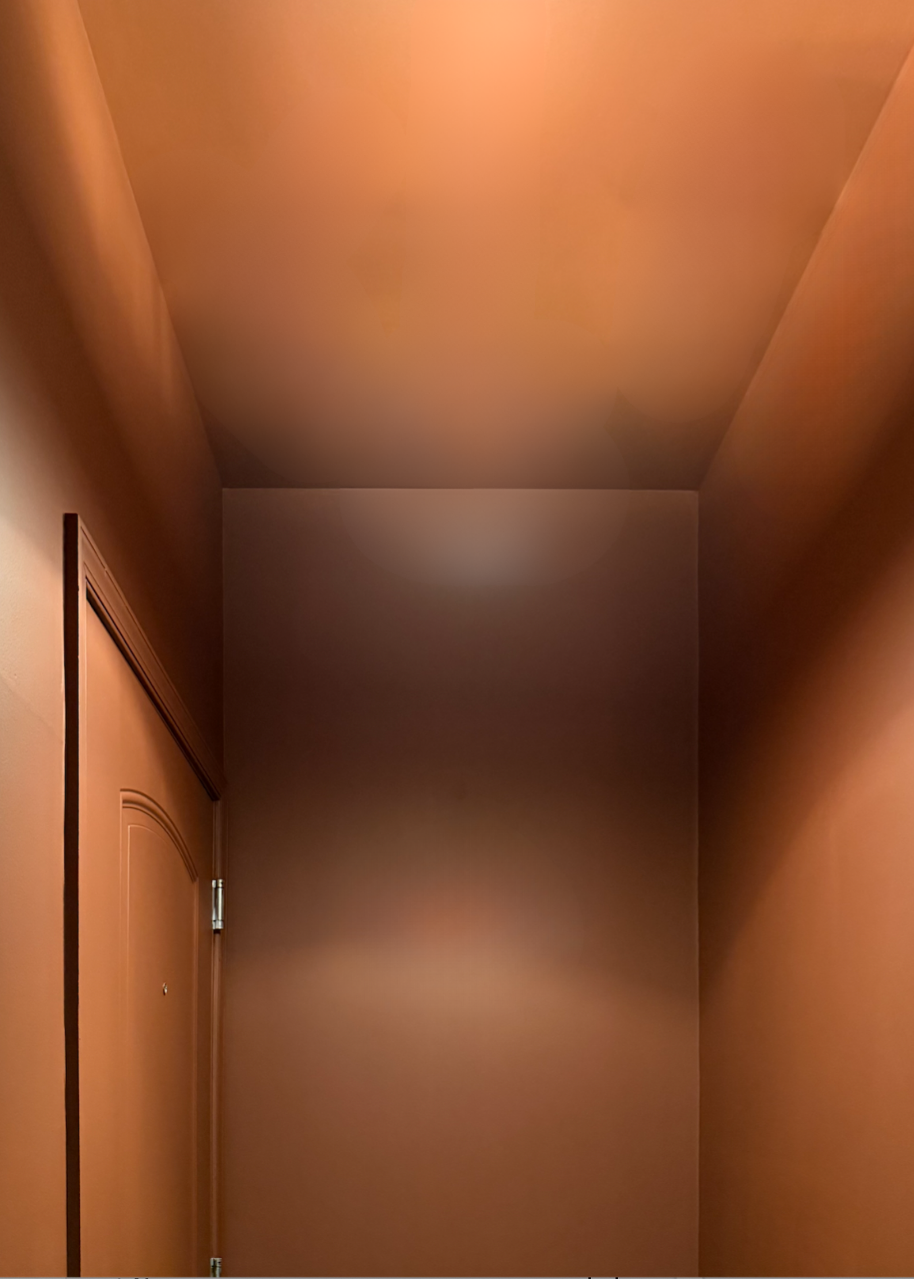
Dark Color Drenching: Cozy, Sophisticated, Drama
Darker color drenching creates an entirely different effect.
Deep greens, moody blues, charcoal tones, earthy browns, and warm blackened neutrals can make a room feel intimate, cocoon-like, and highly designed. Instead of trying to make the room feel larger, darker drenching embraces the scale of the space and turns it into an experience.
This is where many people get nervous — they assume dark paint automatically makes a room feel smaller.
Technically, yes, darker colors absorb more light. But in practice, fully drenching a room in a deeper tone often removes the hard edges that visually define the size of the room in the first place. The boundaries become less obvious, which can actually make the space feel more expansive and layered.
In NYC apartments, darker drenching works particularly well in:
Dining areas
Powder rooms
Bedrooms
Home offices
Spaces with strong natural light
Rooms with interesting molding or architectural texture
The mistake most people make is pairing dark walls with bright white ceilings and trim. That contrast chops the room apart visually and often makes ceilings feel lower. Fully drenching the room creates a much more sophisticated result.
The Ceiling Matters More Than People Think
One of the biggest shifts in modern interior painting is moving away from the idea that ceilings always need to be bright white.
In a color drenched room, painting the ceiling the same color as the walls can:
Blur harsh ceiling lines
Make the room feel taller
Create a softer visual transition
Reduce visual clutter
Add warmth and atmosphere
This is especially impactful in apartments with uneven natural light or awkward ceiling heights. Sheen matters, and the primary goal in these spaces is subtle variation, versus stark separation.
Most color drenched spaces work best with:
Matte or flat ceilings
Matte or eggshell walls
Satin or semi-gloss trimdepending on the desired contrast
How Natural Light Changes the Aesthetic
Color drenching is extremely dependent on lighting conditions.
A warm taupe in a south-facing Brooklyn apartment may feel bright and creamy all day long. The exact same color in a north-facing Manhattan studio could suddenly feel moody and gray. Similarly, dark colors in rooms with strong natural light often feel rich and dimensional rather than heavy.
Before committing to a full apartment color drench, it’s critical to evaluate:
Natural light direction
Time of day
Existing flooring tones
Artificial lighting temperature
Finish/sheen levels
Architectural shadows
This is where many DIY projects go wrong. A color that looks perfect on a swatch can behave completely differently once it wraps an entire room.
Should Every Room Be Color Drenched?
Not necessarily. Some apartments benefit from full-apartment continuity using tonal variations of the same color family. Others work better with selective drenching in specific rooms to create contrast and mood shifts throughout the home.
A few strong approaches include:
One soft neutral throughout the apartment for a gallery-like feel
A darker drenched bedroom paired with lighter living spaces
Tonal layering using slightly different shades room-to-room
A dramatic powder room or office as a focal point
The best approach depends on:
Apartment layout
Ceiling height
Amount of natural light
Existing finishes
Personal aesthetic
Whether the goal is brightness, warmth, mood, or refinement
Should You Color Drench Your Apartment?
Color drenching is less about trend and more about atmosphere.
When executed thoughtfully, it can make a small apartment feel larger, quieter, warmer, more architectural, and significantly more intentional. It softens visual clutter, creates cohesion, and brings a level of refinement that standard “white trim and accent wall” painting often lacks.
The key is understanding how color, finish, and light interact within the specific conditions of your space — especially in New York apartments, where every room behaves differently.
Got Questions?
Out team at Undertone Interiors helps clients evaluate not just what color to paint a room, but how the entire apartment will feel once the color fully surrounds the space. Because the difference between a room that simply looks painted and one that feels intentionally designed usually comes down to the details.
Contact us to set up a free in-home or virtual estimate today.